Case Study: user-centric, mobile development for the YOUCAT Foundation
Creating an app is one thing. Establishing a bond with users and giving them a genuine reason to keep using the app is an entirely different and much more challenging matter. That’s why we were delighted to help our client, the YOUCAT Foundation, when they reached out for assistance with their mobile app development. Today, the app is thriving, with over 60% of users returning for the content they value. Read on to learn how changing the tech stack and conducting numerous user studies improved user retention and satisfaction.

Table of contents
The Client
The YOUCAT Foundation is a German-based, but operating globally, non-profit organization dedicated to supporting people on their faith journey. Their goal: to educate young Catholics in a way that’s modern and suitable to their needs.
The challenge
When YOUCAT reached out to us, they already had a working app and a user base. The YOUCAT Daily app was accessible for two mobile operating systems, Android and iOS and was also developed using these two, native technologies. The app had a global reach, with most users coming from Latin America, United States and Europe.
The stakeholders’ initial, and most important goal was to increase the number of users, so the development had to go hand in hand with a strong marketing campaign.
When the app, thanks to marketing campaigns and positive reception, reached a desirable number of users, we changed our focus to improving user satisfaction and user retention.
The setup
After the product discovery workshop, the initial scope was mapped out. We assembled a team to address the product goals. It consisted of:
- Front-end developer for Android (Native Android)
- Front-end developer for iOS (Native iOS)
- Back-end developer (Node.js)
- Product designer
Lessons learned
During the development of the YOUCAT Daily app, the team began to recognize the challenges of simultaneously working on two separate versions for both iOS and Android. This often resulted in one version lagging behind by the end of a sprint cycle.
Balancing attention between the two platforms occasionally caused delays in one version. As time progressed, metrics indicated a slowdown in the pace of development.
During a sprint retrospective, the team observed that the metrics did not align with the desired outcomes, leading them to reassess their approach.
Pivoting for better results
During discussions, the team explored various ways to enhance the existing code. One recurring suggestion was to rewrite the entire app from scratch. The proposed version would utilize React Native, a technology designed for multi-platform mobile apps, offering potential scalability advantages for future growth.
One of the team’s developers took the initiative to experiment with this approach. After dedicating some time to it, he presented a segment of the redeveloped app to his colleagues. The team acknowledged this approach as one viable solution among others.
The team presented a new approach to the client’s product owner and stakeholders, discussing the ongoing challenges with the project. The client was open to the proposed changes, and after consultation with stakeholders, the team received approval to change the entire technology stack. This conversation is a great example of why honesty and radical transparency is one of our key values and how it can be beneficial for both sides, the team and the client.
The benefits of technological pivoting
After the first sprint, it became evident that the new approach was beneficial. The client appreciated the outcome. Adopting React Native streamlined the development process because:
- we were working with a single codebase (instead of two),
- delivery time of new features was reduced,
- application components were reusable,
- the new version of the app was built with clear goals in mind and with tools and methods (such as Expo) that support future scaling,
- we could keep the client up to date with the Expo Go tool.
The way the team worked also changed. When the work became faster, more predictable and less complex, the team decided to change their main framework from Scrum to Kanban. The change was swift, and resulted in more streamlined working.
The setup and tech stack after the pivot
After pivoting from Native technologies we worked with the following setup:
- Front-end developer (React Native)
- Full stack developer (Node, React Native)
- Product designer
- Scrum master
The final tech stack we were working with was:
- React (18.2.0v)
- React Native (0.72.3v)
- Expo (49.0.0v)
- NativeBase (3.4.25v)
- Apollo Client (3.7.17v)
- Firebase Analytics, Firebase Messaging, Firebase App (17.5.0v)
- Axios (0.27.2v)
Product Strategist - the secret ingredient
A product strategist guides the direction of digital products using market insights and validation data. They ensure development roadmaps align with business objectives and maintain clarity in goals, validation criteria, and timelines. At Boldare, our product strategists are pivotal in project execution.
After the YOUCAT Daily app team achieved their initial goals related to user acquisition, there was a need to transition the strategy towards further product development. Recognizing this need, we proposed integrating a product strategist role. We presented this idea to the client’s product owner. Following a discussion about the potential advantages, our proposal was approved, and Aneta, a product strategist, was onboarded to our Scrum team.
Her responsibilities included ensuring that:
- the business objectives remained relevant,
- validation criteria were established,
- key business metrics were tracked,
- timelines for validation were outlined,
- the development scope was in line with the product goals.
Most crucially, Aneta steered the product development in a new direction, using various tools and research methodologies. Below is a description of certain activities and their outcomes, as steered by the product strategist role.
Build-measure-learn in use
The Build-Measure-Learn cycle is a continuous loop used in Lean Startup methodologies where a product or feature is built (Build), its performance is tracked and data is gathered (Measure), and insights from that data inform the next actions or iterations (Learn), optimizing the product for better results.

Throughout the entire time working on the application, the team, together with the product owner, continuously prepared a list of hypotheses for validation. Some of the ideas also came from the users themselves, who requested specific solutions. These hypotheses were then tested by implementing new features to the app and studying user behavior to see how they worked in reality.
Product hypothesis and validation
Here is an example of a test we did with users of the app - some real research we conducted to check how the obligatory “onboarding” process influences the number of users who sign up to the app.
This is what the hypothesis card looked like:
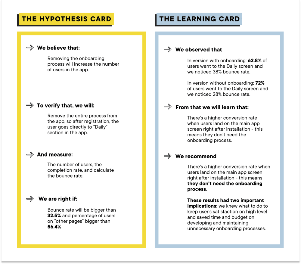
We believe that: Removing the onboarding process will increase the number of users in the app. To verify that, we will: Remove the entire process from the app so after registration, the user goes directly to the “Daily” section in the app.
And measure: The number of users, the completion rate, and calculate the bounce rate. We are right if: The bounce rate is higher than 32.5% and the percentage of users on “other pages” is higher than 56.4%
We tested two versions, and learned that:
- In the version with onboarding: 62.8% of users went to the Daily screen and we noticed a 38% bounce rate.
- In the version without onboarding: 72% of users went to the Daily screen and we noticed a 28% bounce rate.
From that we learned that there’s a higher conversion rate when users land on the main app screen right after installation - this means they don’t need the onboarding process. The recommendation was to maintain the current state and keep the app without the onboarding process.
These results had two important implications: we knew what to do to keep user satisfaction at a high level and we saved time and budget by not developing and maintaining unnecessary onboarding processes.
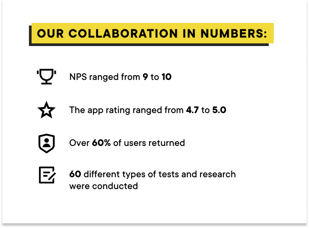
We conducted over 60 different types of tests that influenced the shape of the app and helped to keep users happy.

Users - a crucial source of information
When we say that our products are user-centric we don’t use that description lightly, and the YOUCAT Daily app is a great example. When we wanted to find out what really matters to current active users and to learn about their needs, we conducted a user survey. The hypothesis we wanted to check was “The high user retention of the YOUCAT app suggests that it gives users real value.”
To verify that, we designed a survey using a Google form with six statements and one open question. In each statement users could mark the level to which they agreed on the following scale, from 1 - I strongly disagree to 5, I strongly agree.

Of the 6,645 users who received the survey, nearly 2,000 responded, giving us an exceptional conversion rate of 28.5%! We received over 650 declarative (non-mandatory) responses that included app appreciation feedback (praise), suggestions for improvements, and reported issues. The respondents communicated in six languages: English, French, German, Polish, Portuguese, and Spanish.
Here are some facts we learned thanks to this research:
- Most users indicated that the YOUCAT Daily app delivers its core value and function: it serves as a daily Catholic inspiration (90% of responders agreed or strongly agreed). They also mentioned using it daily to strengthen their faith (also 90%, with a slightly higher result for “agree” than “strongly agree” this time).
- 5% of all new functionality or improvement suggestions refer to features that have already been developed. We should ensure greater visibility and accessibility for these features to increase their usage.
After the research, the product strategist proposed some actions to be taken, here are just two examples:
- To run an opportunity solution tree module to verify which responders’ suggestions would be worth testing as opportunities.
- To research notifications features, as some users indicated that they would find them useful.
We implemented most of the suggested actions:
- We conducted an opportunity solution tree workshop to determine which user suggestions could enhance the app and its reception.
- Our research on notifications aided in increasing the number of returning users. The main findings indicated that push notification campaigns significantly impact the “Returning Users” metrics, and push notifications generally don’t have a substantial negative impact on users.
“In our design process, user feedback is gold,” explains Anna Bil, a Product Designer who worked with YOUCAT. “To make the most of it, we utilized the Opportunity Solution Tree, a tool that aids in uncovering potential opportunities and transforming them into features that users love. This tool assisted us in formulating hypotheses tailored to user needs and prospective business benefits. Every hypothesis served as a stepping stone - if it was validated positively, it matured into a feature. If validated negatively, it offered invaluable insights. A significant number of the app’s features underwent user validation, ensuring that users discovered real value and delight in every interaction and return.”

Project Outcomes
The app has garnered popularity and positive feedback from users. The YOUCAT Daily app consistently draws 30k monthly users, with 20k returning regularly. This acclaim is further highlighted by its stellar ratings: 4.7 on the Google Play Store and a 5.0 on the iOS App Store.
We facilitated a cost-efficient development process by transitioning from native iOS and Android to React Native technology using the Expo platform.
Building on a foundation of trust, our collaboration with the YOUCAT Foundation expanded beyond the app. We also undertook the redesign of their website, enhancing data collection processes and introducing digital reporting.
The app’s development took place over two years, focusing on the Foundation’s objectives: engaging new users and retaining active ones. Decisions, such as adopting React Native technology, were made to support the project’s objectives. Using the opportunity solution tree and various user research methods, we explored ways to optimize the user experience. Our approach was iterative, emphasizing ongoing refinement through Build-Measure-Learn cycles and consistent feature updates based on user feedback. Timelines were met, and Boldare ensured the project aligned with the client’s requirements.

Conclusion
Thanks to an iterative approach, influenced by Lean Startup principles such as the Build-Measure-Learn cycle, YOUCAT Daily app users could voice their opinions and significantly influence the app’s development.
Our team remains deeply committed to the product, further enriched by our continuous collaboration with the product owner. This relationship is marked by tremendous trust, evident in an average NPS score of 9.6 from the product owner.
We believe that Boldare’s partnership with the YOUCAT Foundation has been mutually beneficial. We secured a business partner who values our expertise, and in turn, our client enhanced their digital tools, fostering a deeper connection with their audience.
Share this article:


