Psychology and UX design
The success of any digital product depends on the user experience. You could say that UX is the interaction of the human and the digital. This is a challenge for UX designers, to factor in the complexity of the human perspective to their product. Good UX design – and ultimately, the success of the product – depends on an understanding of human psychology. Read on to explore how our modes of thinking can impact digital product design.

Table of contents
Why is psychology important to UX design?
Good software design is user-centered. And so it should be. A designer who creates a product based solely on their own perspective, expecting the users to get accustomed to it, is almost certainly going to fail. It is necessary to understand that users are human, and humans can be impatient, are often unmotivated, prone to making mistakes, and have both a limited memory and limited attention span. Factors such as these influence our everyday behavior, and definitely influence our interactions with digital products and how we use them.
By incorporating psychological principles in UX design, we can make a product more appealing to users, focus their attention, encourage them to take certain actions, and make the overall experience more meaningful and enjoyable. All of which helps to build customer loyalty and satisfaction.
Human-Computer Interaction – what is it?
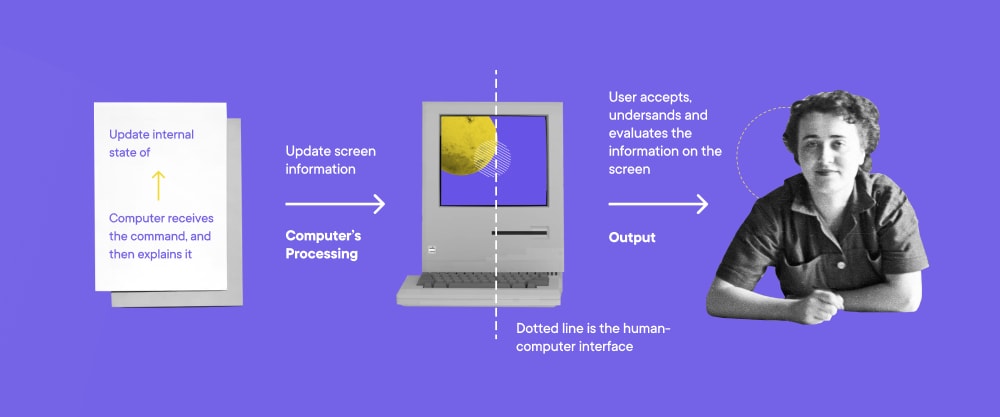
Human-computer interaction, or HCI, is the study of what takes place at the point of interface between users and digital technology. Let’s break it down:
- Human - a person interacting with the system, a user who wants or needs to achieve something via the interface.
- Computer – a digital system or tool.
- Interaction – the connection between the two, involving some form of interface, such as graphical (GUI) or voice (VUI), that permits communication.

The goal is to make the interface intuitive to use and act as an enabler for what the user is trying to achieve. If the user is repeatedly having to ask themselves, “What should I do now?”, or is experiencing feelings of annoyance or frustration, then the interface is failing because the user’s attention has shifted from the task at hand to the tools being used to accomplish it.
A focus on human-computer interaction helps designers create better, more efficient user interfaces (UIs) and improves the user experience. Usually, this means engaging with some form of the build-measure-learn loop: researching user needs and desires, creating a UI, testing the UI with users, analyzing the results, and incorporating the learning into the next design.
Where is HCI most apparent?
There are three main HCI application areas: technologies (examples include virtual reality, and mobile or wearable interfaces); domains (examples include security, password systems like CAPTCHA tests, or gaming, mapping user/player actions to effects and results); and ideas (for example, different methods of data visualization).
To put it simply, human-computer interaction is what is taking place at the point of user interface, and affects the whole user experience. And HCI, UI and UX are all impacted by human psychology. In the next section, let’s look more closely at three aspects of cognitive psychology and how they can affect the human-computer interface, and UI/UX design.
Understanding cognitive psychology
Digital products are designed for use by humans, not robots. To create a UI tailored to humans, we have to remember that they are psychologically complex and sometimes irrational. Unlike robots or automated systems whose functioning is programmed and conditioned along strict logical lines, human actions and decisions are dependent on many factors, including mood, previous experience, biases, environment, and stress.
To create a successful design, we need to understand humans. We need to understand ourselves. Cognitive psychology is the study of how humans think and process information, taking into account our internal mental processes around attention, memory, and how we perceive the world around us; not to mention other elements such as language, problem-solving, learning and metacognition/self-reflection.
- Attention is about focus; the extent to which we can identify and process specific information, prioritize what is relevant to the situation or goal and filter out what isn’t. For example, when you are participating in what feels like a boring call and decide to finish writing an important email at the same time. As you continue to listen to the conversations in the meeting, you split your attention. It is possible to do two things at once; however, the split in your focus will impact on your performance of one or both tasks.
- Memory is all about storing and retrieving information, and includes both working memory and long-term memory. Working memory is about temporary storage – keeping in mind the information necessary to carry out a task, for example. Whereas long-term memory includes all information ‘saved’ throughout your lifetime. Working memory is limited, and prone to being affected by distractions.
- Perception relates to the information we take in through our senses, and how we interpret it. The process includes what we see, hear, touch, etc. and also our understanding of the incoming stimuli and how they affect our behavior.
The key to applying cognitive psychology to UI/UX design is to understand the above principles, including how they affect human responses and behavior, and use that understanding of how attention, memory and perception work to create a more seamless and positive user experience.
Using psychological principles in digital product design
Nobel laureate Daniel Kahneman proposes that there are two entirely different processes that govern human thinking and decision-making: slow thinking and fast thinking.
Slow thinking is responsible for reasoning and analysis, whereas fast thinking applies when there is a need for an instinctive or emotional decision. Slow thinking is deliberate and requires concentration. Fast thinking, on the other hand, is much more spontaneous and effortless, we utilize it by default unless we want to react more consciously.
When designing digital experiences, we have to keep in mind which of these two thinking modes the user might be utilizing when they encounter the product. In most situations, the goal of UI/UX design is to make the user’s actions as effortless and intuitive as possible so that they can use the product without strain.
However, we must also recognize the points in the user journey when slow thinking is required, and design accordingly by providing encouragement and support to the user as they move towards their goal.
The following psychological principles and effects can be applied to the user journey and used to create a better digital product.
- Zeigarnik effect – This states that people tend to remember the details of unfinished actions better than finished ones. In UI terms, designers can tap into the Zeigarnik effect by including progress bars, gamification, badges and rewards, etc. As long as the task is in progress, you can leverage the user’s improved attention and focus on the task to motivate completion.
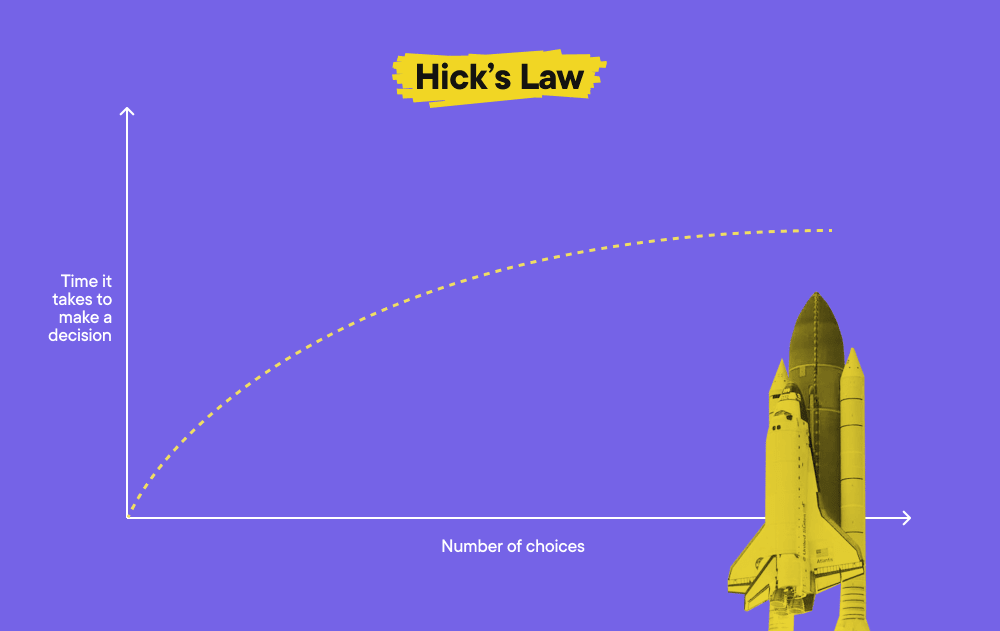
- Hick’s law – The principle here is that the more choices we face, the harder it is to make a decision. In interface terms, this means reducing the available choices wherever possible. At the least, choices should be categorized or presented in a way that aids comprehension; for example, by highlighting recommended options to help the user make their decision.

- Cognitive overload – When the user is given too much information or too many tasks to carry out simultaneously, the result can be cognitive overload. Put simply, you’re overtaxing the user’s working memory which leads to performing the tasks with less efficiency or not performing them at all. In interface terms, try to minimize any sort of distractions while the user is performing a task. If the task or product is complex, familiarize the user with frequently-used features first, and let them explore the more sophisticated functionalities later.
- Von Restorff effect – This states that given a selection of multiple, similar objects or stimuli an individual is most likely to remember the one that stands out due to size, color or some other basic characteristic. When the user is faced with a screen (or other interface) with various options and potential actions, you can draw their attention to specific items (such as a call to action or notification) using color, 3D, movement, etc. It is important to avoid the element you want to emphasize competing for users’ attention with other UI elements. In other words, only one element ‘on-screen’ should display a different characteristic to attract the user’s attention.
Designing UI and UX with psychology in mind – a case study
To illustrate how this information can be used in a real-life design, let’s take a look at how Upwork has considered cognitive bias to optimize the process of job post creation.
Avoid cognitive overload: break a complex process into steps.
In order to avoid overloading the user with numerous fields, there’s a design decision to guide the user through the complex process step-by-step, feeding it to them a bit at a time. This way the user is always focused on a single task.
Progressive disclosure: let the users explore more complex features once they get more advanced.
As you can see on the screenshot below, the less frequently used, more complex features have been hidden so that less experienced users don’t get stuck on them but can find them easily when necessary.
Zeigarnik effect: remind users about their unfinished actions.
Here, the tendency to better remember unfinished actions is reinforced with the help of notifications. By reminding users about an unfinished action, the interface prompts them to finalize the process.
Hick’s law: make the user’s choice easier by limiting the options.
There might be dozens of job categories available for the user to choose from, many of which might seem similar or somehow overlapping. Instead of leaving the user to scroll through multiple category options, Upwork suggests the three most likely job categories based on the job title the user has already provided.
Psychology and the user experience
As long as the user is the focus (and the user is human!) understanding user psychology and cognition are essential to good digital product design. UI and UX designers should be aware of how attention, memory and perception directly influence behavior and human-computer interaction. Most important is the question of how to use that awareness to influence and guide users to a successful result when using the product. For more on this subject, check out our follow-up article that looks at how our built-in cognitive biases impact on UI/UX design.
Authors:
Sylwia Rapacz - QA Engineer, a student of the Masters of Science in Computer Science at Georgia Tech, with courses like Human-Computer Interaction and Introduction to Cognitive Science
Kateryna Kaida - Product Designer at Boldare
Share this article:


